
How I Designed My Award-Winning Scientific Poster
Scientific posters are a strange format. You spend months, sometimes years, doing research, and then you are expected to fit the whole story into one large piece of paper that someone should be able to understand while walking around a conference with a cup of coffee in their hand.
Last year, I had to do exactly that for the Ecology of Soil Microorganisms conference. What I didn't know at the time was that the poster would end up receiving the award for Best Poster.
Putting things together
Before opening Illustrator, the first question was: who is going to see this?
The conference brought together researchers working in soil microbial ecology, so I wasn't communicating to the general public. I could use scientific terminology and assume a certain level of knowledge. At the same time, I couldn't assume that everyone would be familiar with my specific research topic.
Then came the second question: what do I actually want to show?
A scientific paper contains a lot of information. A poster cannot, or at least shouldn't. Together with my collaborators, I decided which results were important for the story and what could be left out.
Only then did I start designing.
I sketched different possibilities, organized the information, chose the colors and started putting everything together in Adobe Illustrator. Figures, text, results, methods and conclusions slowly found their place. This is probably the part I enjoy the most: taking many separate pieces of information and finding a structure that makes them work together. It is like a puzzle.
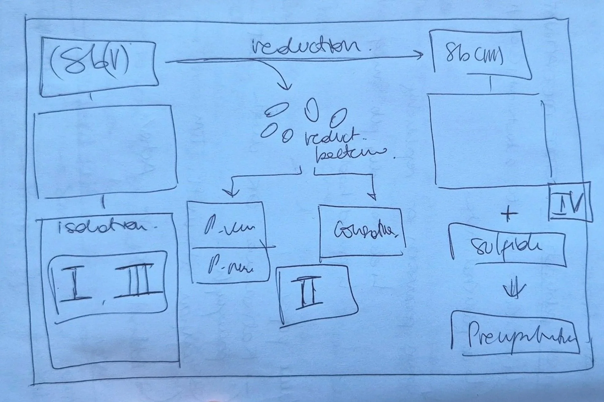
One sketch idea for the poster.
Checking, checking, checking
Finishing the design doesn't mean the poster is finished.
Everything had to be reviewed again. My collaborators checked the scientific content, citations had to be correct, figures had to be readable and the information needed to make sense without me standing permanently next to it explaining what I meant.
And then there are the less exciting technical details. A poster that looks beautiful on your computer still needs to survive being printed at a very large size. Resolution matters. Colors matter. The file needs to be prepared correctly for printing, including working with CMYK rather than designing only for a screen.
Eventually, it was ready.
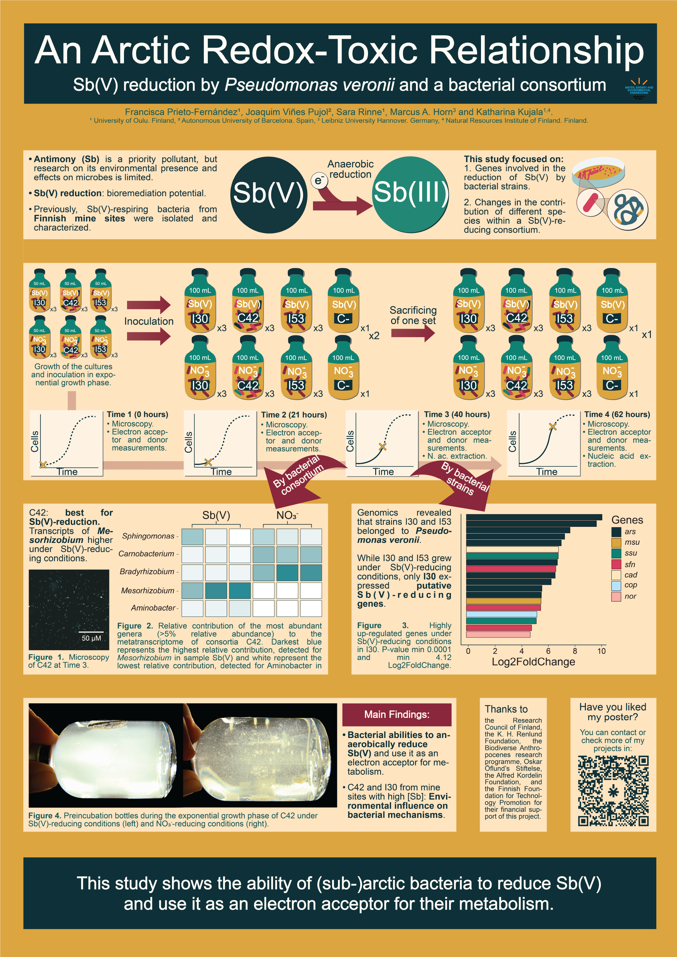
Poster presented at academic conference Ecology of soil Microorganisms in 2025.
And then you have to stand next to it
A poster is not only something you design. You also have to present it.
So, poster printed, conference outfit selected, I stood next to it and started talking to people.
This is another part of poster design that I think is sometimes forgotten. The poster shouldn't contain every sentence you are going to say. It should support the conversation. Someone sees something interesting, stops, asks a question, and suddenly you are discussing your research.
Not every conversation makes you feel great, though.
I remember talking with one expert in the field and leaving the conversation feeling quite insecure about my work. Conferences can do that. You are surrounded by people who know an incredible amount about your topic, and one difficult conversation can suddenly make you question research you have spent months working on.
So I definitely wasn't walking around thinking I had created the best poster at the conference.
Quite the opposite.
Surpriseeee
Just when the conference was getting to an end, the same professor with whom I had a conversation about my poster, was the one who delivered the award for the Best Poster.
And somehow, it was mine.
I was genuinely surprised.
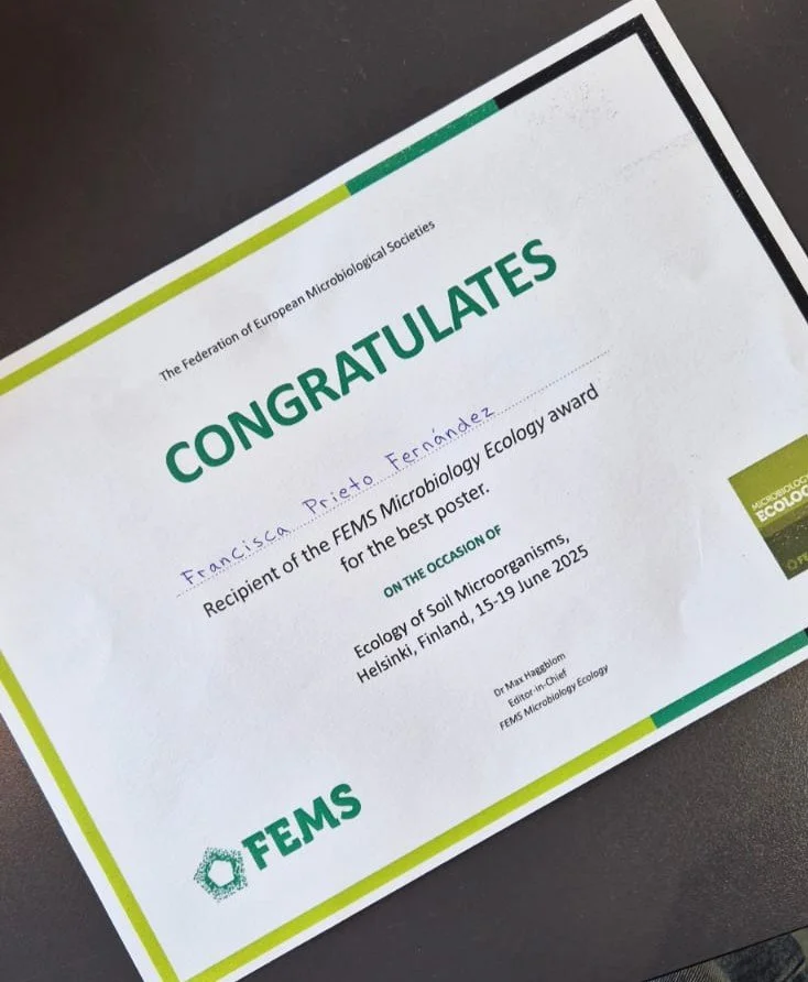
Diploma for best poster.
Looking back, I like this story not only because I won something, but because it reminds me of how much work goes into communicating research well. The science needs to be solid, of course. But then it has to be selected, organized, reviewed, visualized and finally communicated to another person.
Today, when I design a scientific poster, graphical abstract, presentation or infographic, I still follow a very similar process.
Who is going to see this? What do they need to understand? And what can I remove so that the important part becomes clearer?
Sometimes, putting things together also means knowing what to leave out.
